Which background colour is right for your headshot?
See what suits your profession, then change yours for free, right in your browser.
Drop a photo here, or click to browse.
Or paste a photo from your clipboard.
Accepts JPEG, PNG, WEBP, HEIC. Up to 14MB.
Need a new professional headshot? Try Fotoria
Which background colour should a headshot have?
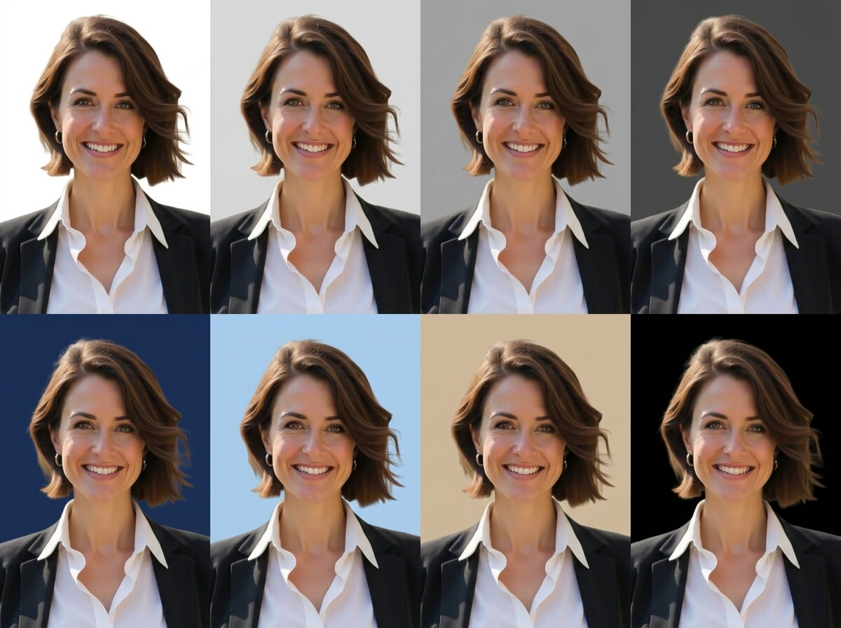
Light grey is the safest, most versatile choice, if you only want one answer. It suits almost any skin tone and wardrobe, it's forgiving of ordinary lighting, and it works everywhere from a LinkedIn thumbnail to a company directory page. Here's how each option compares:
- White: Clean and modern, and the most familiar choice for a website or profile page. Needs genuinely even lighting, or it turns grey in patches and light clothing can dissolve into it.
- Light grey: The safest default, and the one most corporate photographers reach for. Separates cleanly from dark and light clothing alike, and hides uneven lighting better than white.
- Mid grey: Adds a little depth without tipping into drama. Works particularly well with lighter hair and clothing, where a paler background would flatten everything out.
- Charcoal: A more serious register, common in executive and board portraits. Needs careful lighting against dark hair, or the two can start to merge.
- Navy: Signals stability and trustworthiness rather than approachability, the register finance, law, and corporate leadership tend to want.
- Light blue: The standard in healthcare, and has been for decades. Soft, calm, and familiar enough to signal the profession before anyone reads your title.
- Beige: Reads as approachable and a little informal. Suits therapists, coaches, teachers, and anyone whose work depends on people feeling comfortable with them.
- Black: The most dramatic option, and the narrowest. Suits actors, musicians, creative directors, and executives after gravity rather than approachability. Needs careful edge lighting against dark hair.
What background suits your profession
There's no rule, but there are conventions, and being conspicuously outside them is usually a distraction rather than a differentiator.
- Corporate, finance, and law: Lean toward the serious end of neutral, but the three aren't interchangeable. Charcoal reads as executive authority, which suits senior leadership portraits specifically. Navy signals stability and trustworthiness, and does that more directly than plain grey, which is why it's common in finance and law. Medium grey is the safe, traditional default if you'd rather not pick a register at all. If your firm has a house standard, follow it, consistency across a team page matters more than any individual choice.
- Healthcare: Light blue or white almost universally, and either one reads as clinical in the reassuring sense: clean, calm, unremarkable. It's conventional to the point of being invisible, which is exactly what you want when the photo's job is to make a patient feel they're in careful hands. An off-white or very pale grey softens it slightly if pure white looks too stark under your lighting.
- Real estate: White or light grey for a clean, agent-directory look, and it's one of the few fields where an environmental background genuinely works: a property or streetscape says something relevant about what you do. Warm beige is worth considering too, since it reads as welcoming in a way stark white doesn't always manage. Just make sure the property looks like the kind you actually sell.
- Technology and startups: Light grey, which reads as clean and modern without much formality, or plain white for a brighter, more open feel. Both work better here than a heavier charcoal or navy: formal studio portraits can read as stiff in a sector where most profile photos aren't.
- Creative fields: Design, photography, music, art direction, have the most latitude and the most to lose by looking generic. Black or charcoal add real drama if that fits your work; beige or another warm neutral reads as approachable without falling back to plain grey. The risk isn't being too bold; it's a background that says nothing because it was the default, not a choice.
- Academia and education: Usually land on a warm grey or light grey, a classic, unshowy register that reads as respectable rather than corporate. A lightly blurred office or campus setting works too, and books or shelves behind you are a cliché, but clichés persist because they communicate quickly.
- Actors and performers: Follow industry conventions that are stricter than anywhere else and vary by market. Check what your local casting standard expects before applying general headshot advice.
The thing most people get wrong: contrast
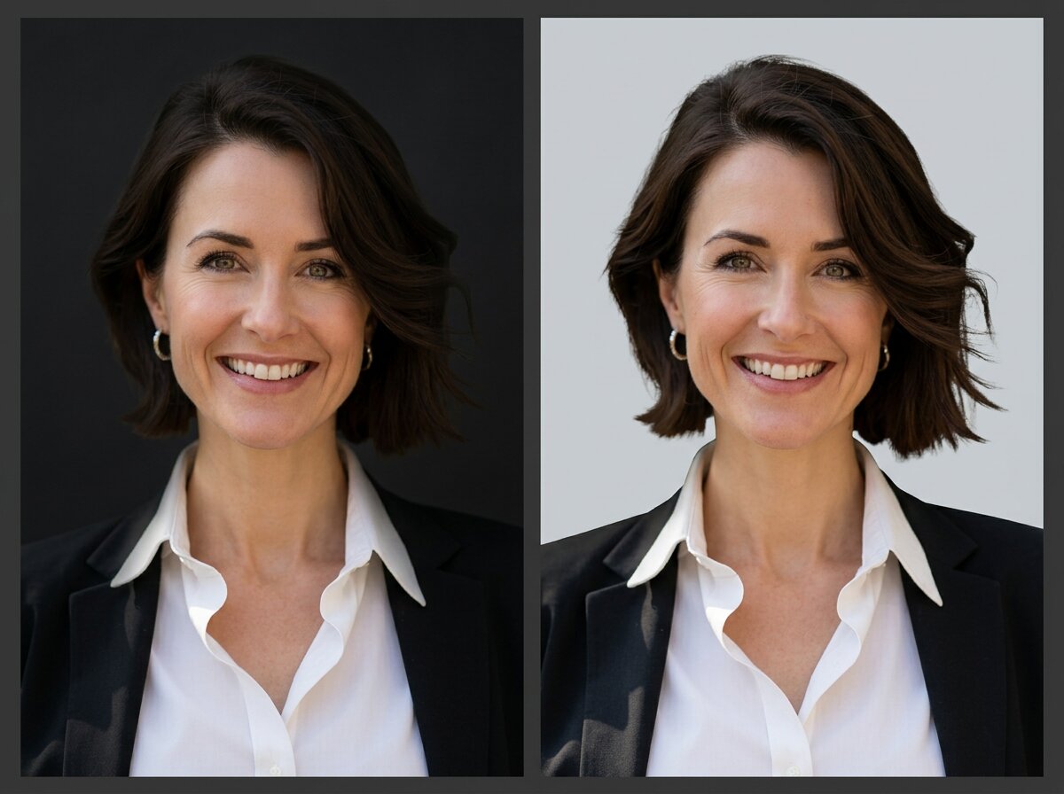
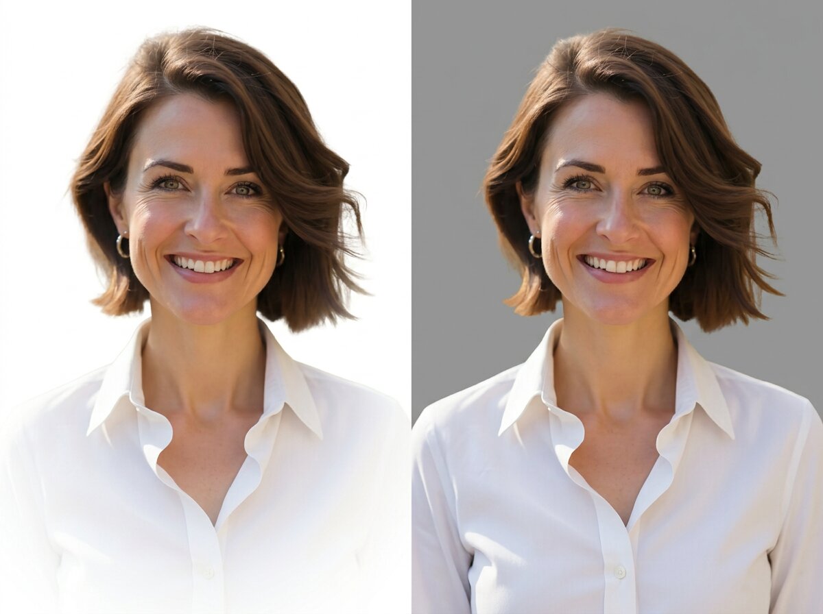
The background's job is to make your outline legible. Everything else is secondary, and it's the part people skip.
Dark hair against a dark background merges. The top of your head disappears, your silhouette becomes indeterminate, and the whole photo reads as murky even though nothing about it is technically wrong. Photographers solve this with a separate light on the hair; without one, use a lighter background.
Light clothing against a white background does the same thing in reverse. Your shoulders dissolve, and you end up as a floating head. It's the most common failure in DIY headshots and the easiest to fix: move to mid grey and the problem disappears entirely.
The workable rule: your background should differ in brightness from both your hair and your clothing. Not dramatically. Enough that your edges are visible.
If you're unsure, mid grey is the answer. It's the only background that provides separation from dark and light simultaneously, which is why studios keep it on the wall.
Solid, blurred, or a real setting?
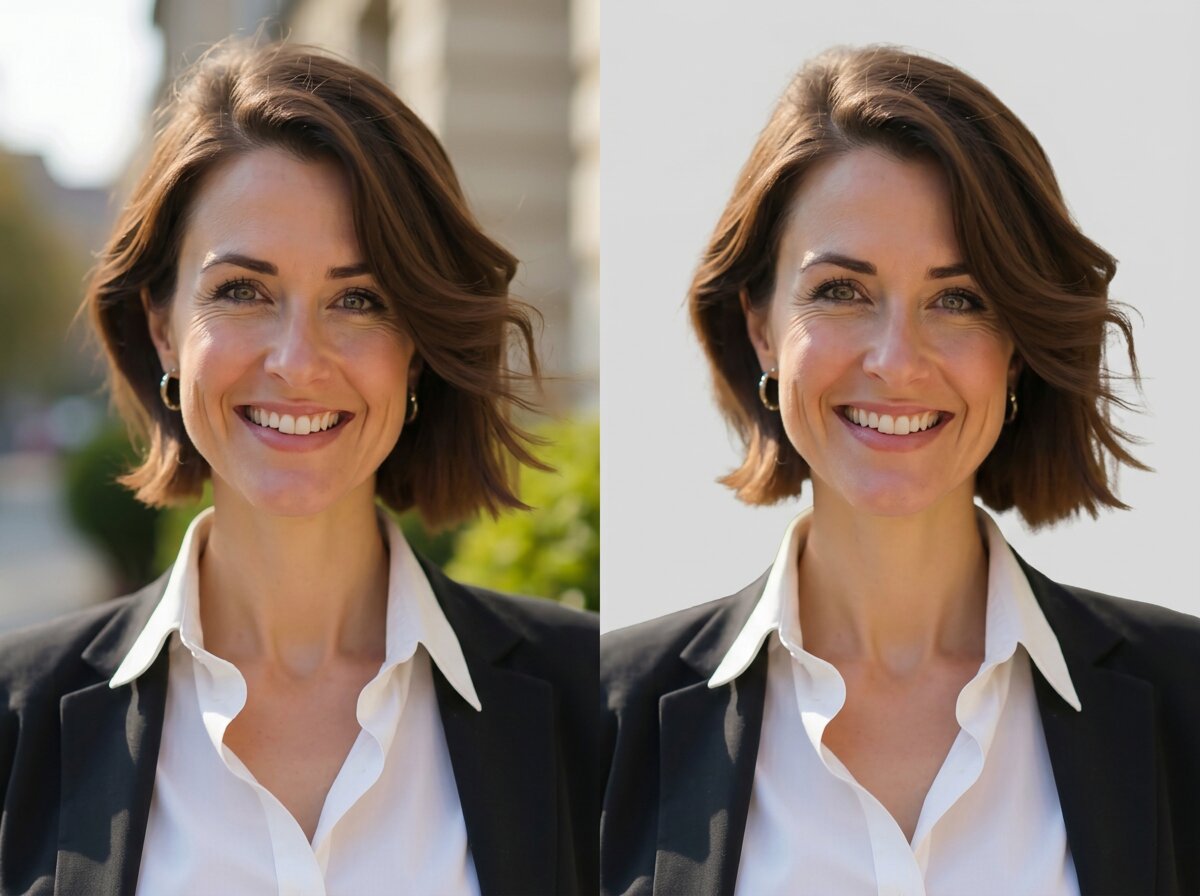
Solid backgrounds are the most versatile and the hardest to get wrong. They crop cleanly to any shape, they never date, and they work at every size, from a full-width website banner down to a 40-pixel comment avatar. If the photo has to serve several purposes, solid is the pragmatic answer.
Gradients, a soft shift from lighter to darker across the frame, add a small amount of depth without introducing anything to look at. They're common in corporate portraiture and they read as slightly more produced than flat colour.
Environmental backgrounds put you somewhere: an office, a workshop, a site, a street. When the setting is relevant to your work, they carry information a solid colour can't. When it isn't, they're just clutter with a shallow depth of field.
Two cautions on environmental. It has to survive being cropped small, at avatar size, a blurred office is visually identical to a blurred anything, so you've added complexity for nothing. And it dates faster: an office you no longer work in, or a background that's obviously from a particular era, ages a photo in a way a grey wall never does.
Why some replaced backgrounds look obviously fake
Three things give it away, and only one of them is about the cut-out quality everyone worries about.
Lighting direction that doesn't match. If you were lit from the left and the replacement background implies a window on the right, something reads as wrong before anyone works out what. This is why swapping in a photographic scene is much harder than swapping in a colour: a flat background has no implied light source, so there's nothing to contradict.
Colour spill from the original background. Stand close to a green wall and green light bounces onto your hair, your shoulders, the side of your face. Remove the wall and the green is still there, sitting on your skin with nothing to explain it. Shooting against a neutral wall avoids the problem entirely; a strongly coloured one makes clean replacement genuinely difficult.
Edges, particularly hair. This is the one people expect, and it's mostly a solved problem now, but it's where the difference between tools still shows. Look at the wisps at the top of the head rather than the shoulders; shoulders are easy.
For what it's worth, this is why the backgrounds here are solid colours and gradients rather than photographic scenes. A flat background can't have a lighting direction that contradicts yours, which removes the largest source of the fake look before it starts.
What changing the background won't fix
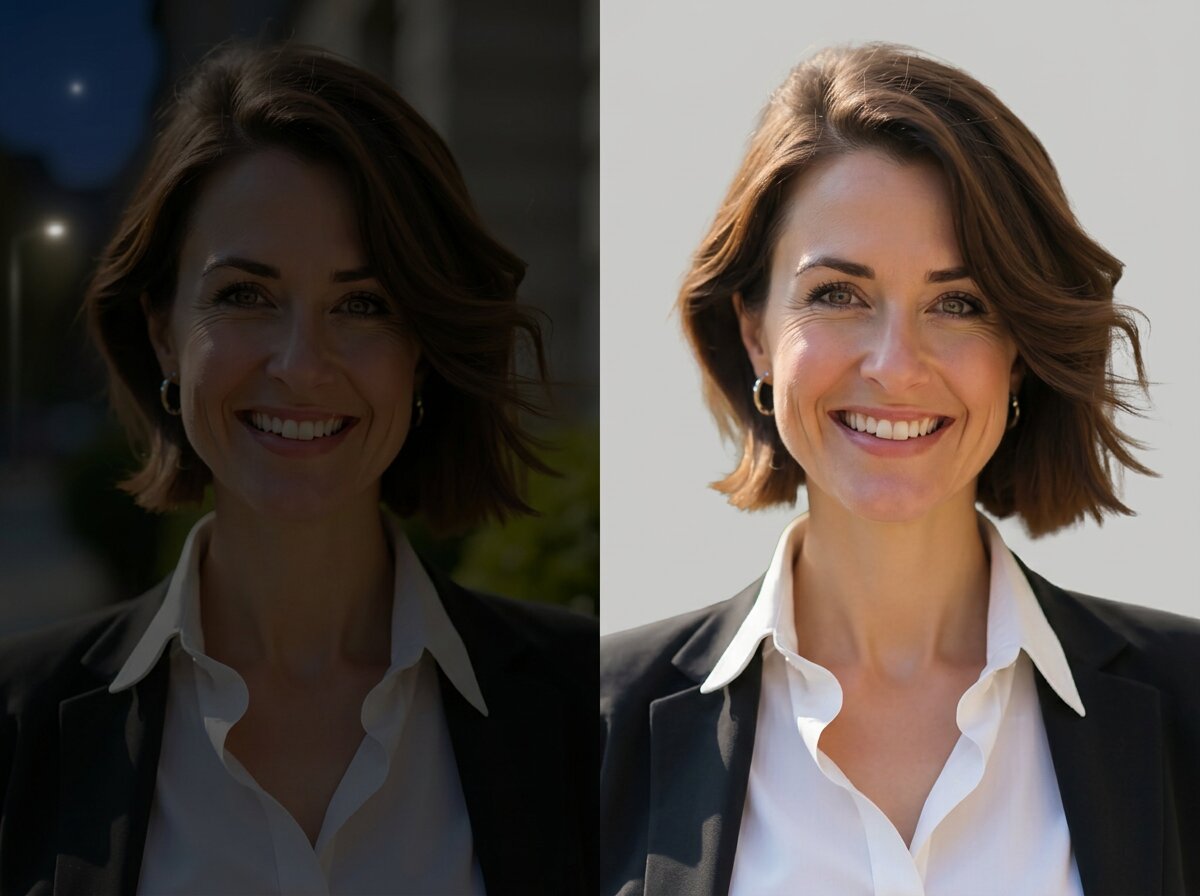
A clean background makes an average photo look tidier. It doesn't make it a good photo, and it's worth being clear about the line.
Lighting stays exactly as it was. Harsh overhead light, shadows under the eyes, one side of the face brighter than the other: none of that lives in the background, so none of it changes. This is the single biggest difference between a photo that looks professional and one that doesn't, and it's untouched.
Framing stays as it was. If you're too far from the camera, or off-centre, or shot from below, a new background doesn't move you. Cropping helps a little and only a little, because cropping in also throws away resolution.
Expression stays as it was. A background can't fix a smile that didn't reach the eyes.
Resolution stays as it was. A small or soft image is still small and soft with grey behind it.
Colour cast stays as it was. If fluorescent light gave your skin a green tint, that tint is on your skin, not your background.
So: if the background is the only problem, changing it solves the whole thing. If the photo has other problems, a new background makes them slightly more visible, because there's less else to look at.
Frequently asked questions
- What's the best background colour for a professional headshot?
- Light grey, if you want one answer. It separates cleanly from both dark and light hair and clothing, it doesn't compete for attention, and it works in practically every professional context. White and charcoal are the next safest.
- Is a white background good for LinkedIn?
- Yes, with one caveat: LinkedIn displays profile photos as circles on a white or near-white page, so a white background can make the photo appear to have no edges at all. Light grey holds its shape better in that specific context.
- Should my headshot background match my company's brand colours?
- Rarely worth it. Brand colours are chosen to stand out, which is the opposite of what a headshot background should do, and a strongly coloured background competes with your face. If your organisation requires it, keep it desaturated.
- Can I use a blurred office background instead of a solid colour?
- Yes, if the setting is relevant to your work and the photo will mostly be seen at a reasonable size. At small sizes a blurred background is indistinguishable from any other blurred background, so you've added complexity without adding information.
- Why does my hair look strange after changing the background?
- Usually colour spill. If your original background was strongly coloured, light bounced off it onto your hair and shoulders, removing the background doesn't remove that tint, so it sits there unexplained. Photos taken against neutral walls replace far more cleanly.
- Does this work on group photos?
- It works, but headshots are what it's built for. With several people the subject-to-background edge gets much longer and more complex, so results vary.
- Do I need to sign up?
- No. It's free and unlimited, and nothing you upload leaves your device.
- Is my photo uploaded anywhere?
- No. Background removal and compositing both run in your browser. Nothing is uploaded, stored, or sent to a server.