LinkedIn cover photo maker
Design a LinkedIn banner at the exact size LinkedIn wants — 1584 × 396 — with safe zones showing what your profile photo covers.
Banner Photos (optional)
Profile Photo (optional)
Drop a photo here, or click to browse.
Or paste a photo from your clipboard.
Accepts JPEG, PNG, WEBP, HEIC. Up to 15MB.
No watermark. No account needed.
Need a professional headshot to match? Try Fotoria
LinkedIn cover photo size and dimensions
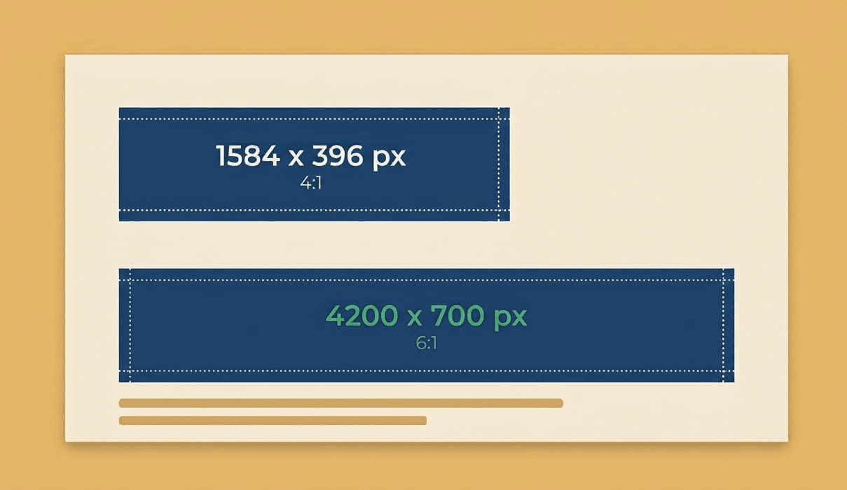
A LinkedIn cover photo is 1584 × 396 pixels, a 4:1 ratio. That's the personal profile banner: the same image LinkedIn calls a background photo, and most people call a banner or a header.
Company pages use a different, wider shape. Don't reuse one for the other.
| Personal profile | 1584 × 396 px (4:1) |
|---|---|
| Company page | 4200 × 700 px (6:1) |
| Minimum usable width | 1584 px: anything smaller gets stretched and softened. |
| Accepted formats | JPG, PNG, GIF |
| Maximum file size | 8 MB |
| Recommended export | JPG, quality ~90, under 2 MB |
About GIFs. LinkedIn accepts them, but most people see only the first frame. Treat it as a static image.
About 1128 × 191. You'll see that size quoted for company pages in a lot of guides. It's the older spec: the same 6:1 shape at roughly a quarter of the resolution, and using it is one of the most common reasons company banners come out soft. Export at 4200 × 700 instead.
Specs verified against LinkedIn's Help Center, August 2026. LinkedIn changes these without announcing it, so we re-check quarterly.
What your profile photo actually covers
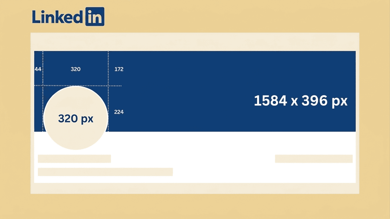
A 1584 × 396 banner is never fully visible. Your profile photo sits on top of the lower-left corner, and it's considerably bigger on mobile than on desktop, which is where most people will see your profile.
 DesktopLinkedIn Profile Cover
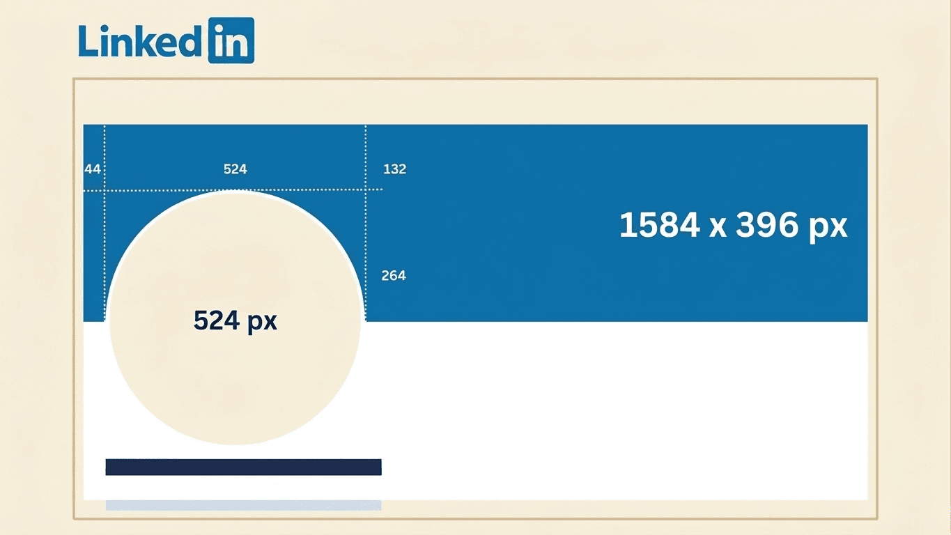
On desktop the profile photo is roughly 320 pixels across. On mobile it's about 524 pixels, covering noticeably more of the banner. Anything you put in that corner is hidden behind your own face, and it's hidden worse on the device that matters most.
 Mobile AppLinkedIn Profile Cover
The restricted area is roughly 524 × 264 pixels in the bottom-left. Keep your name, your title, your logo, and any call to action out of it. Center or center-right is safe.
Two smaller things worth allowing for. Your name and headline sit immediately below the banner and come close to its bottom edge, so leave a little breathing room down there. And keep important elements a margin in from the left and right edges, since rendering shifts slightly between devices and window widths.
The editor above shows all of this as overlays you can toggle on and off. Switch between the desktop and mobile views before you export, and design for mobile: if it works on a phone it works everywhere. The reverse isn't true.
Why your LinkedIn banner looks blurry
Almost always one of three things.
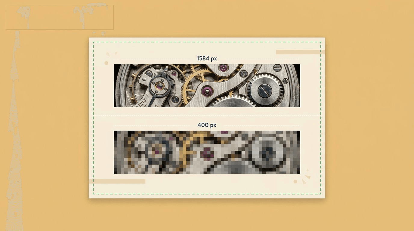
Your source image was too small. Anything under 1584 pixels wide has to be stretched to fit, and stretching never adds detail: it just spreads what's already there across more pixels. Start at 1584 × 396, or larger at the same ratio.
You used the wrong shape. A personal banner is 4:1 and a company cover is 6:1. Forcing one into the other softens everything. On company pages, exporting at the old 1128 × 191 spec is a frequent culprit.
LinkedIn's compression got it. LinkedIn re-compresses every upload, and it compresses large files harder. A 6 MB PNG often ends up looking worse than a well-tuned 1.5 MB JPG.
One thing that doesn't help: raising the DPI. LinkedIn works in pixels, not inches. A 300 DPI export at the same pixel dimensions looks identical on screen: it just produces a bigger file, which means more compression. Set the pixel size correctly and ignore DPI entirely.
LinkedIn cover photo ideas
The banners that work say something specific. The ones that don't are decoration. A few directions, depending on what you're using your profile for.
If you're job hunting, state what you do, plainly. Recruiters scan profiles fast, and a banner naming your specialty does more work than an abstract graphic. Say what kind of role you're after if you want to be direct about it.
If you're announcing something, a new role, a launch, an open position, or a talk you're giving: use it. Banners take thirty seconds to change, so treat yours as current rather than permanent. Nothing looks staler than a banner promoting an event from last year.
If you're consulting or freelancing, lead with the offer, not the logo. What you do, who you do it for, and one way to reach you. Keep the contact detail well clear of the bottom-left corner.
If your work is visual, show it. A product shot, your workspace, you doing the thing you do. Almost always stronger than stock imagery.
If you want to use a quote, keep it short and attribute it. Long quotes turn illegible once your profile photo covers part of the frame.
Whichever direction you take: one idea per banner. A banner carrying a tagline, three logos, a QR code, and your contact details reads as clutter rather than credibility.
Start with one of our pre-made styles and customize them to your liking:
How to design a banner that works
Design for mobile first. Most profile views happen on a phone, where your profile photo covers more of the banner. Get it right there and desktop takes care of itself.
Pick one focal point. A single clear message beats a collage of logos, taglines, and credentials. A banner is a first impression, not a resume.
Start high-resolution. LinkedIn compresses on upload, so a soft source only gets softer. Never scale a small image up to fit.
Crop, don't stretch. LinkedIn's 4:1 ratio is unusually wide, and almost no photograph is shaped that way already. Reframe the image properly rather than squashing it.
Check your contrast. If you're putting text over a photo, it has to stay readable against every part of the image behind it, not just the part you happened to be looking at while you designed it.
Preview before you publish. Look at your banner with the profile photo and mobile view applied, not as a standalone image. That's the only view that matches what visitors actually see.
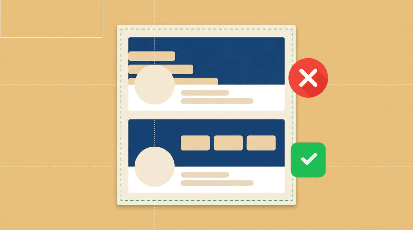
Should you put your face on your LinkedIn banner?
Faces get processed faster and more automatically than text. On a profile, a face is usually the first thing anyone actually looks at, before the headline, before the summary, before any of it. So the question isn't decorative. It's about what you want someone to feel in the half-second before they read a word.
On LinkedIn specifically, there's a wrinkle: your face is already there. Your profile photo sits over the lower-left of your cover photo, so unlike most platforms, a face in the banner is a second face, competing with the first.
That changes the answer. Two faces of the same person, at different sizes, a few hundred pixels apart, usually reads as cluttered rather than confident. Which means the useful version of this question is narrower: should your LinkedIn background photo support the face you already have, or do a different job entirely?
When a second face earns its place
It works when the banner photo is doing something your headshot can't: showing you in context rather than in isolation.
Speakers and trainers. You on a stage, mid-talk, in front of an audience. That's evidence, not decoration.
Coaches and consultants. Working with a client, running a session, in the room where the work happens.
Real estate agents. You at a property rather than against a studio backdrop.
Anyone whose job is visibly physical. Surgeons, chefs, trades, physiotherapists, photographers. The setting says as much as the face.
The test is whether the banner photo tells someone something new. If it's just a second portrait, cut it.
When to skip it entirely
You're at a large company and the brand carries weight. Your headshot plus a clean branded background is stronger than two portraits.
You're an individual contributor. Engineers, analysts, designers, researchers: your work is the credential. Use the banner for a project, a visualization, or plain color.
You're job hunting. The banner is better spent stating what you do and what you're looking for. Recruiters scan; a legible line of text beats a second photo.
Your headshot is already strong. Don't dilute it.
Who benefits most from a face on LinkedIn at all
Even where the banner stays face-free, the profile photo is doing heavy lifting for anyone whose audience is trusting a person rather than an organization: independent consultants, recruiters, financial advisers, insurance brokers, therapists, freelancers, founders raising or hiring, salespeople, career coaches, and anyone whose next opportunity arrives through a stranger deciding they seem credible.
For a brand page, a publication, or a community, a wordmark or product shot carries a cover photo perfectly well. Plenty of strong profiles have no banner face at all.
What kind of photo, if you use one
Different photos send different signals, and none of them is correct in isolation.
Direct eye contact, relaxed smile. Approachable. The default for anyone who wants to look easy to contact.
Sharp, well-lit, neutral expression. Competent and credible. The safer choice when you're selling expertise.
Candid, mid-conversation or mid-motion. Authentic. Common among coaches and community builders.
Unusual angle or bold color. Memorable over polished. A deliberate trade.
Pick whichever matches how you actually show up in person. A photo that contradicts your first meeting is worse than no photo.
Placement, if you do it
Your profile photo occupies the bottom-left, and your name and headline sit immediately beneath the banner. So put a banner face right of center, inside the safe zone, with the subject looking back toward the middle of the frame rather than off the edge.
Faces near the left edge get partially covered by your own profile photo, which looks like a mistake rather than a choice. The safe zone overlay in the editor above shows exactly where the boundary falls.
A good photo does instantly what a paragraph of copy takes much longer to say. That's the real argument for one: it gives someone a shortcut past the part where they'd otherwise have to read to work out who you are.
If your profile photo is doing less work than your cover photo, that's worth fixing first. Fotoria makes professional headshots from photos you already have.
How it works
- 1.Pick a template, or start from a blank canvas.
- 2.Add your name, title, and tagline. Text resizes to fit automatically.
- 3.Add a headshot if you want one. We'll cut out the background for you.
- 4.Check the safe zone overlays, then download at the exact size LinkedIn needs.
LinkedIn profile photo size
Your profile photo is 400 × 400 pixels at minimum, and LinkedIn accepts much larger. Anything from 400 × 400 up to around 1000 × 1000 is fine; going higher only matters for retina displays.
It displays as a circle, so the corners of a square image get cropped away. Center your face and leave margin at the edges, or you'll lose the top of your head.
It also sits on top of your banner, which is why the bottom-left corner of a cover photo is effectively unusable.
Need a set of great photos? Try Fotoria
Use cases
- New job, new title: update your banner to match in minutes.
- Promote an event, launch, or open role directly on your profile.
- Give your company page a banner that matches your brand.
- Refresh a stretched or blurry banner LinkedIn re-compressed.
Frequently asked questions
- What size should a LinkedIn cover photo be?
- 1584 × 396 pixels for a personal profile. This tool exports at exactly that size, so LinkedIn doesn't recompress or re-crop it.
- Why does part of my banner get covered?
- Your profile photo sits over the lower-left corner, about 320 pixels across on desktop and about 524 on mobile, so it covers more on a phone. Toggle the safe zone overlays in the editor to see exactly what's hidden before you download.
- Why does my LinkedIn banner look blurry?
- Usually the source image was under 1584 pixels wide, so it had to be stretched. Sometimes it's LinkedIn's compression on an oversized file. Exporting at exactly 1584 × 396 as a JPG under 2 MB avoids both.
- What's the difference between a cover photo, background photo, banner, and header?
- Nothing. They're all the same image. LinkedIn's own interface calls it a background photo; most people say cover photo or banner.
- Where should I put text on a LinkedIn banner?
- Center or center-right, and out of the bottom-left corner where your profile photo sits. The safe zone overlay in the editor shows exactly where the boundary falls.
- Can I make a banner for my company page?
- Yes. Choose the company page size from the download menu. It's 4200 × 700, a wider 6:1 shape than the personal profile banner, so don't reuse one for the other.
- Isn't the company page size 1128 × 191?
- That's the older spec. Same 6:1 shape, roughly a quarter of the resolution, and a common reason company banners look soft. Export at 4200 × 700.
- How often should I update my banner?
- Whenever what it says stops being true: a new role, a new focus, an event that's finished. A banner advertising something from two years ago is worse than a plain background.
- Do I need to sign up to use this?
- No. The editor is free and unlimited, and nothing you upload leaves your device.
- What image formats can I upload for my headshot?
- JPG, PNG, WEBP, and HEIC, including straight from an iPhone.
- Is my photo uploaded anywhere?
- No. Everything, including background removal, runs in your browser. Nothing is uploaded, stored, or sent to a server.